ROUTE ELF MOBILE APP (SELF-PROJECT CASE STUDY)
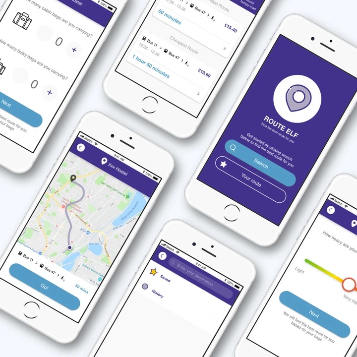
Route Elf is an app for budget traveller with heavy luggage who only want to use public transport
Who is the target audience?
Traveller with heavy luggage who only want to use public transport
What are the primary user goals?
Help user to find a route that suit their situation faster, and avoid upsetting moment.
What problem to solve for users?
Problem:
Traveller with heavy luggage needs a better way to get to their destination because there are many common problems for different travellers that can be solved
Hypothesis:
We believe that by navigate them the best route to the final destination for traveller with heavy luggage who only want to use public transport, they can have a nicer journey and cheaper price to get there.
We will know this to be true when they use least amount of effort to get to their destination without damaging their luggage
My role:
→Concepting→UX research→Wireframing→Prototyping→Visual design
THE USER GOAL AND PROBLEM ARE BASED ON THE RESEARCH BELOW:
GENERATIVE RESEARCH: INTERVIEWS
At the discovery phase of my project, I conducted 6 user interviews in order to get a better understanding of the problem. The questions were mainly about travel/ heavy luggage/ the travel pre planning habit…etc.
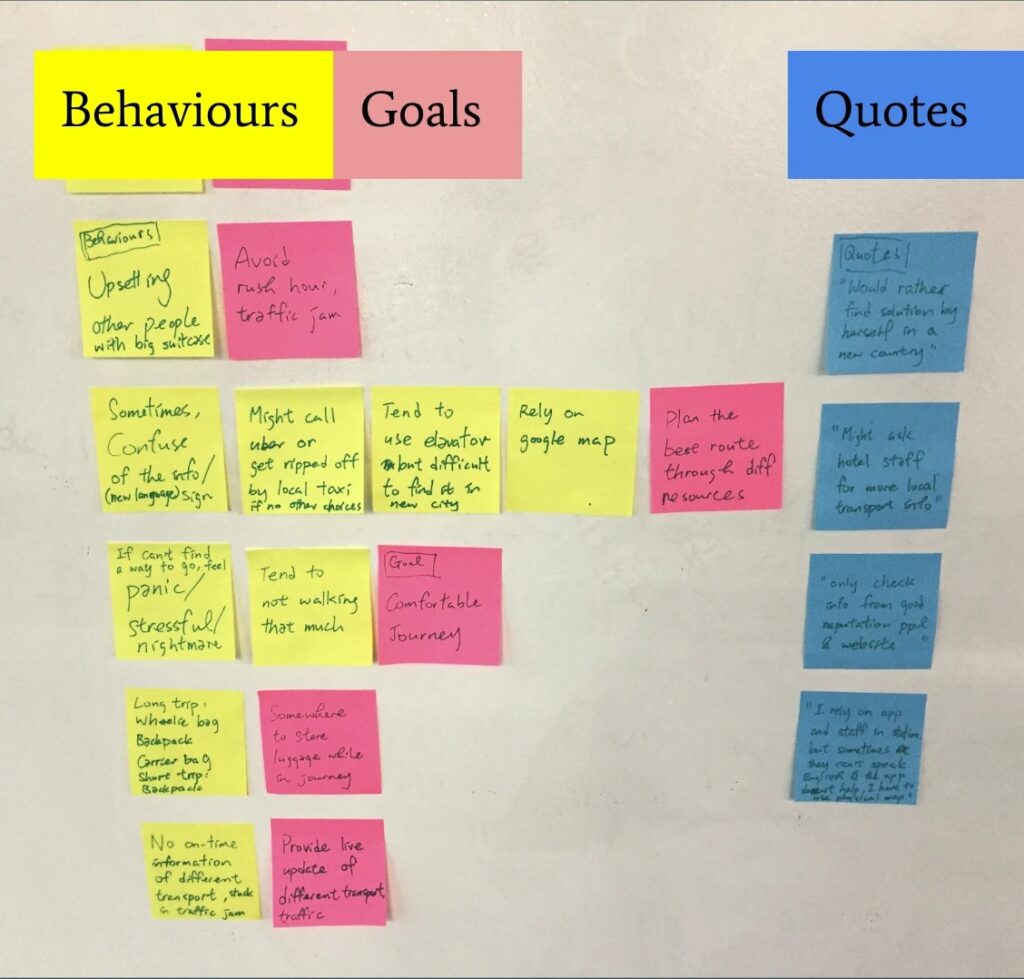
And then i created the affinity map to group the similar behaviour together.
“I rely on app and staff in the station, but sometimes they don’t speak English and the app doesn’t help. I have to use physical map.”
Jack S., Business Development Consultant (Interviewee)
GENERATIVE RESEARCH: AFFINITY MAP
1. Upsetting other passenger with big suitcase
>>Avoid rush hour, traffic jam
1. Confuse of the sign (language)
2. Don’t wanna get ripped off by local taxi
3. No elevator in some stations
>>Plan the best route through different resources
1. panic/stressful if couldn’t find a way
2. don’t want to walk a lot
>>Comfortable journey
1. Carry many different bags at the same time
>>Find the transport that can store your luggage
PERSONAS
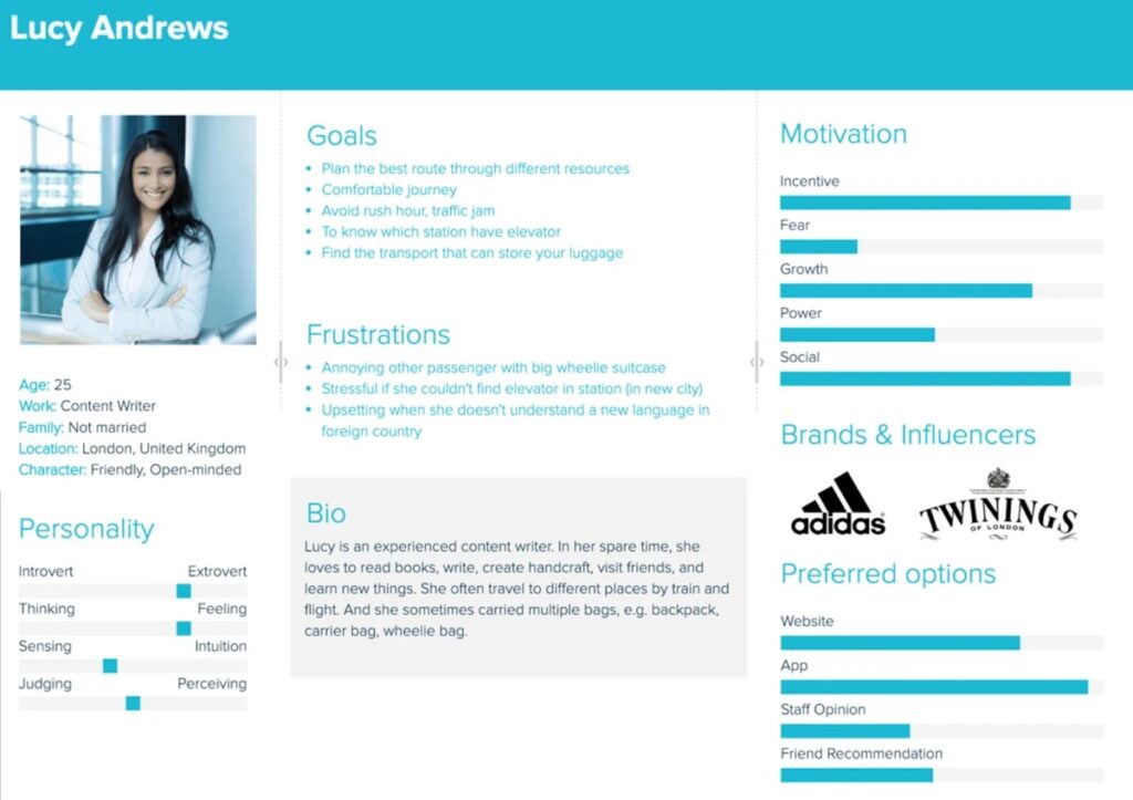
Based on the interviews i set up a persona. I referred to it throughout the entire product development process.
In the persona, I provide information of her bio, personality, goals, frustrations, motivations.
In the user journey and wireframing design process, i tried to achieve the goals and avoid frustrations by referred to it.
CARD SORTING
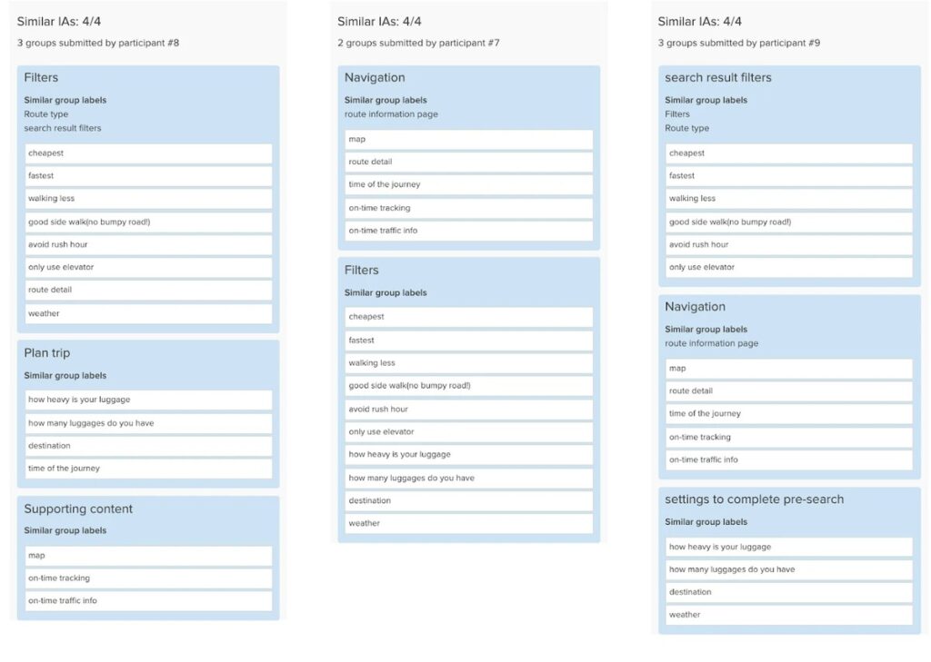
In order to have a deeper insight of the navigation, I decided to do an online Card Sorting session.
As a result, those keywords can divide from three groups:
- -Search result filters/ Filters
- -Navigation/Plan trip
- -Navigation/Supporting content
The card sorting session help me to have a clearer picture of navigation and make the user journey and wireframing easier.
COMPETITIVE RESEARCH
I tried to differentiate the solution from existing products and industry players. After doing competitive research, we found out that other competitors (Citymapper/ Google map) don’t have the filter option of Avoid stair/ avoid rush hour/ less steps…etc.
USER JOURNEY AND USER FLOW
I mapped out the users’ steps to see how I could simplify their journey to help them reach their most important goals with the product.


WIREFRAMES
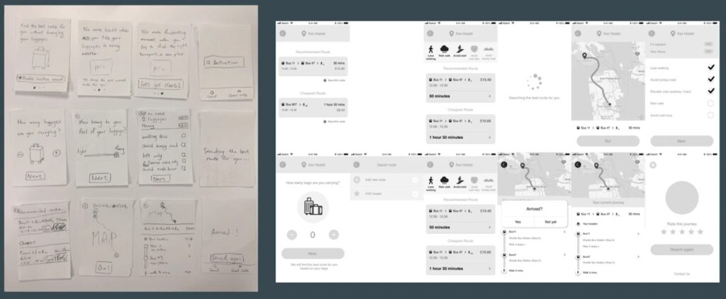
I created wireframes for testing purposes. From pen and paper to low fidelity wireframes, evolution from sketches to current state. In each state, i did user testing to create a better user experience.
USER TESTING
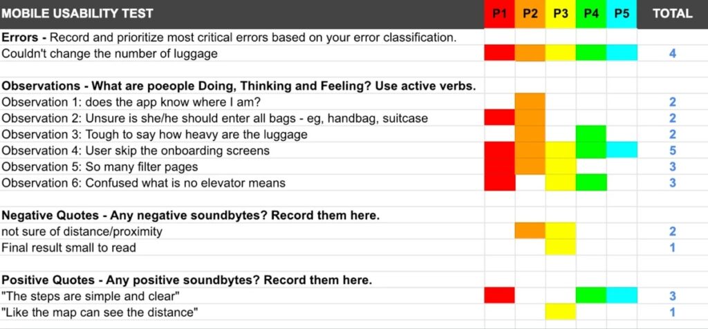
Before creating the final product, I did a testing round in low fi wireframes in order to reveal possible usability problems.
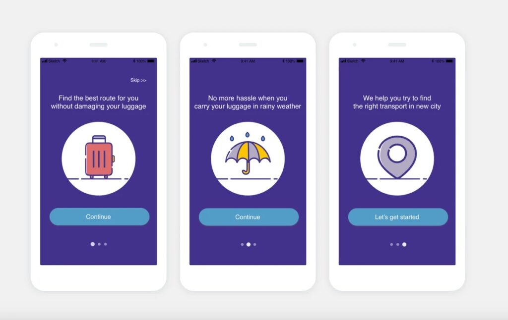
And i found out the common error for the button(couldn’t change number of luggage), and observed that user tend to skip on-boarding screen and confused because there’re too many filters to choose.
UI DESIGN
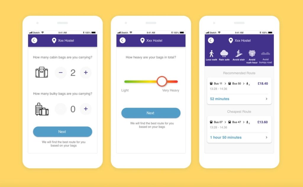
Once I tested out all usability mistakes, I started designing the final screens in Sketch.
I chose fresh and playful colour for the product, as well as fun graphic to create a friendly image.
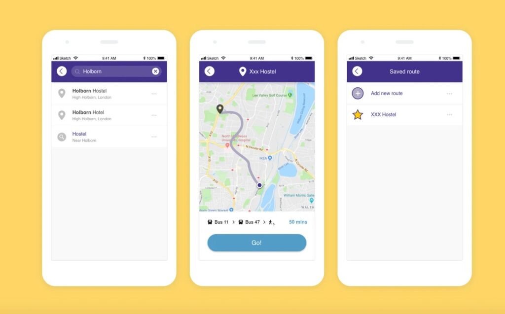
CLICKABLE PROTOTYPE:
HTTPS://INVIS.IO/EMQMZLYQG4N/
WHAT HAVE I LEARNED FROM THIS PROJECT?
Through this project, the research fndings inform my design decisions a lot:
- -Know the behaviours of interviewee, and what goals they want to achieve
- -Know what problem we are going to solve
- -Plan the information architecture
And in order to achieve the goals, i tried to use prioritisation to find features to support those goals:
- -Avoid rush hour, traffic jam
- -Plan the best route through different resources
- -Comfortable journey
- -Find the transport that can store your luggage
>>filter user problem and deliver the best route for them